 The following is a guest blog by Avi Glijansky. Avi is an independent writer/director/producer based in Los Angeles. He’s created over 80 episodes of scripted and un-scripted award-winning webseries and been a semi-finalist for the Screen Writers Colony and the Djerassi Fellowship.
Learn more about his projects by visiting his production company, Highway 9 Pictures.
We’ve all seen it, most of us might have had it, and everybody dreads it. The ‘White Wall Syndrome’. Here are a few thoughts on how to use inexpensive production design to make your story more dynamic.
One of the common traps that new filmmakers fall into – and I speak from experience – is something I’ve come to call White Wall Syndrome. The name references a specific challenge; the white walls that can overwhelm a frame if you’re not careful, but this is about more than that. White Wall Syndrome is my catch-all term for a lack of production design.
When I say production design, I’m talking about all the design elements you place in front of the lens: Your locations, set dressing, props, hair, make up, and of course, wardrobe. Whether your story takes place down the street or in a galaxy far far away, these elements help you establish the world of your story as real and lived-in.
Production design sells the illusion that the apartment where your hero lives really is her apartment and not just the one your friend is letting you shoot in. That the records on the shelves are what he’d listen to, or that the laser pistol she’s armed with is one she’s used for years, and not something ordered off of Amazon last week.
These elements convey details about your characters and their state of mind. It shows your audience who they are without dialogue or exposition, the same way you get a sense of someone just from seeing what their home is like.
One of the reasons why skimping on production design is such a shame, is that not only is it a powerful story-telling tool, it’s also a tool that us indie filmmakers can get a lot out of without necessarily having to spend a lot money. Provided, that is, you take the time to think about what your design should convey and what challenges it can help you conquer.
To help illustrate, I want to point out some of the choices I made in a scene from my web series The Further Adventures of Cupid and Eros.
Cupid & Eros is a comedy set in a world where gods from every pantheon co-exist and aren’t all that different from us mortals. Our main character, the Roman god of love Cupid, has been in a funk ever since his girlfriend dumped him. His best friend, the Greek god of love Eros (actually a goddess in our world), is determined to pull him out of it.
This is the second scene of the first episode and it’s the first time we see where Cupid lives. To save money, I shot the scene in the apartment I lived in at the time. Normally, it looked like this:
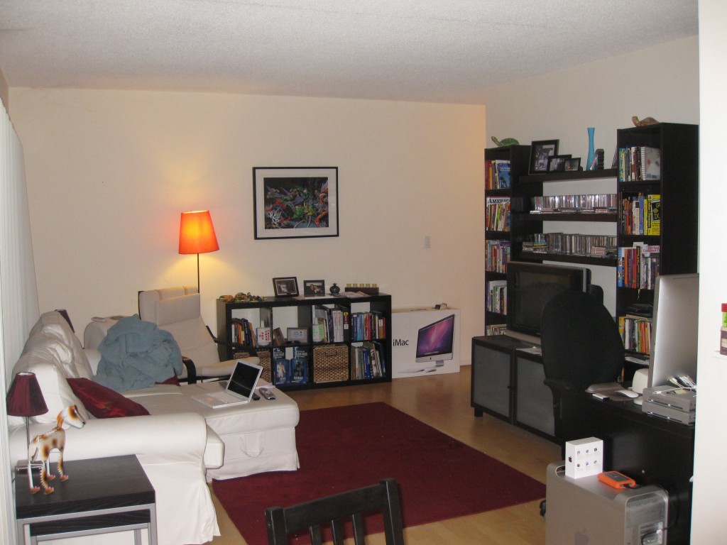
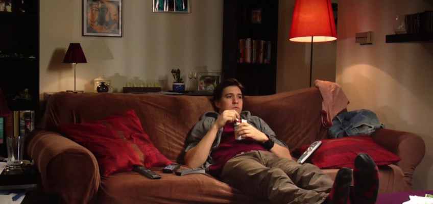
Because we’re still getting the audience up to speed, I wanted Cupid’s place to say a lot about him in general, as well as about where he is at this point in his life – dumped and still not over it. Check out the scene below to see how we used inexpensive production design to get the point across:
Cupid is home alone, eating dinner in front of the TV instead of being out on the town looking for new love. Rather than eating a home-cooked meal or some tasty delivery, we have him eating Spaghetti O’s straight from the can. It’s a small thing, but it’s another way to convey that his existence is kind of sad.
Working with our cinematographer, we also came up with a layout for our set that made the blocking and framing of the scene more dynamic and avoided the white walls I mentioned earlier.
First, we rearranged the furniture so that the couch was floating in the room instead of against the window as it normally was. Doing so created depth in the frame when Cupid is alone, and gave us a more interesting way for Eros to enter and interact with him. The shelves, pictures, and art on the back wall helped fill space behind them, but because they’re far enough away they aren’t distracting.
Lastly, despite the fact that our story takes place in a universe where the gods look like regular folks, we found subtle ways – the hearts on his socks, the reddish t-shirt, his bow by the TV – to reference his mythical nature.
Now, if I hadn’t done any of this, the scene may still have played OK. But if I hadn’t considered the design, I would have missed those chances to add additional layers that convey who Cupid is in our world and where he’s at emotionally when our story begins.
None of this was costly. All the furniture was mine, and we created the mess using my clothes, papers, and mail that I held onto in the weeks leading up the shoot. The pictures of Cupid and his ex were photos of our actor and his wife, that they let us borrow. In fact, the only design elements that I spent money on were a brown sofa cover and enlargements of artwork I’d created for the walls. A lot of production design bang for virtually no buck.
So when you think about your project, try and give as much thought to the production design, as you do to the shots you’re going to compose or the soundtrack you’ll add in post.
What kinds of spaces do your characters inhabit? Are they messy or neat? What books would be on their shelves? What kinds of clothes would they wear and what colors would they be partial to? How can you use the space you have available to you in ways that will keep your shots free of distractions while still feeling interesting?
You might not get as many compliments on your production design as you do on your cinematography or the performances you bring out of your actors, but trust me, your audience will have noticed.


Join the Conversation →