In a time where micro-content on Instagram and Facebook drives marketing campaigns for films big and small, the term ‘key art’ may have diminished a bit in relevance, but there’s still something to be said for the art of the film poster. Let’s take a look.
First, a bit of history. Starting out in the early 1900’s simply as placards outside movie theaters listing the films being showcased within, film posters quickly began including illustrations of a film’s scenes, and with the advent of Hollywood stardom also portraits of the actors and actresses. Where the early posters were very literal representations of what the moviegoer could expect to see on screen, they later became an opportunity to tease the moviegoers by way of symbolism or suggestive imagery. The visual marketing of a film had become another creative level of the filmmaking process. And it still is. With the current need for quickly digestible promotional content on social media, the iconography of a film may be less prioritized now than it was 20 years ago, but all the more reason for you to explore and use the art of the film poster. A picture is, after all, worth a thousand words.
So what makes a great film poster? Let’s see what some of the great posters of decades past have in common.
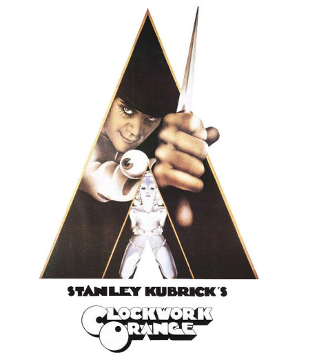
The Clockwork Orange poster hints at the central themes of the film (good vs evil, light vs dark, danger, violence, sexuality) while much is left to the imagination. Why the triangles? Why the dagger? Why the eye? Why is Alex lurking in the shadows?
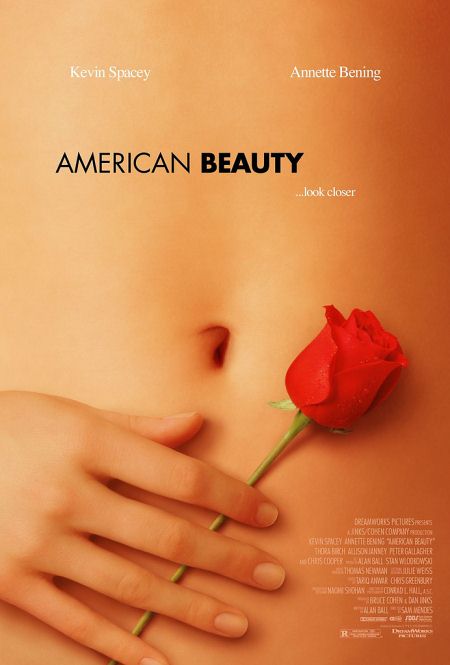
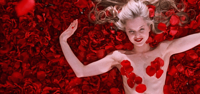
The image used for American Beauty also hints at the central themes of sexuality and desire, while the tag line suggest that not all is what it appears to be. ‘Look closer’ at what? The American dream? The rose? The naked body? Yourself?
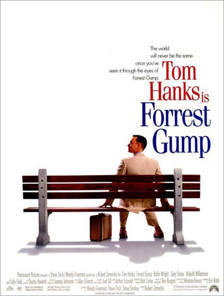
Most of Forrest Gump unfolds as a story told by Forrest as he’s waiting for the bus, so it’s only fitting that the poster recalls the iconic bench. But the image says so much more. Many of the film’s central themes are hidden in plain sight: the loneliness, the journey, the anticipation, leaving the past behind you.
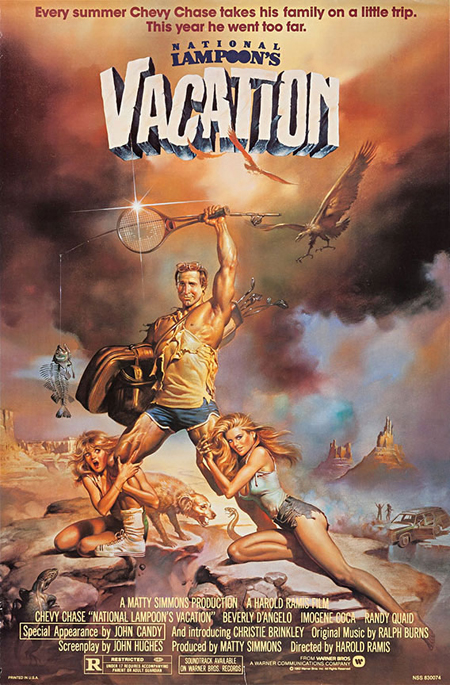
This epic poster for National Lampoon’s Vacation is all about intertextuality. The style is an homage to the film posters of yesteryear, with several of the film’s highlights depicted, but it also calls upon the viewer’s knowledge of iconic film posters like Barbarella or Conan The Barbarian to add humor and kitsch. But even with the lighthearted illustrations, the themes of the film are present: feeling powerful vs feeling inadequate, love vs lust, disaster vs triumph, patriarchy.
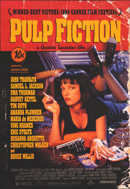
One of my favorite posters, the Pulp Fiction poster is as ‘meta’ as they come. The design is that of the cover of a pulp fiction novel, which Mia Wallace also happens to be reading. It’s a book in a book, that’s actually a movie. The style invokes the kind of pop-culture nostalgia that Tarantino is famed and loved for, but it’s not ‘all style no substance’ either. The image is not a still from the movie, so why is it there? It’s presenting the themes. Crime. Violence. Seduction. Pop-culture. 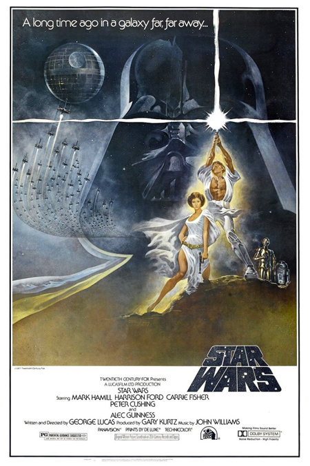 Aah. Star Wars. An iconic poster if ever there was one. Notice a familiarity with the one for Vacation? Certain elements of the plot are hinted at, without revealing too much. Our main characters are introduced. Luke and Leia are both in white – as opposed to the darkness surrounding Darth Vader. Recognize a theme of good vs evil here? What about Luke fighting to get out of the shadow cast by his father – recurring theme in Star Wars? Oh yes. Add to that the alien landscape, the spaceships in motion and the droids trekking through the desert and you have the theme of ‘the journey’.
So there you have it, folks. Even if it’s not staring you right in the face, the best film posters will somehow hint at the themes of the film. Keep that in mind next time you sit down with your graphic designer.




Join the Conversation →